Beehive Analyzer — How to Analyze Any Apiary Location in Minutes (User Guide 2026)
Ask any experienced beekeeper what decides a season and you will rarely hear "my equipment" or "my bees". You will hear one word: location. The same colony, with the same queen and the same management, can produce 60 kg of honey on a good spot and starve on a bad one — two kilometres apart. For centuries, evaluating a spot meant walking the terrain, asking neighbours, guessing at what blooms nearby and how much, and hoping the bees would confirm your judgement over two or three slow seasons.
Beehive Analyzer (beehive-analyzer.eu) is a free web tool that compresses those seasons into minutes. You type a GPS location (or press one button and it uses your phone's location), choose a radius between 0.5 and 5 km, and the tool builds you a data picture of the spot: which nectar and pollen plants actually grow there and how densely, how the terrain and microclimate look, whether there is water nearby, how built-up the area is, which verified plant-distribution layers and pest occurrences scientific databases report, and how this year's flowering season compares with last year. There is even an optional AI report that wraps everything into one coherent, readable assessment.
This guide is written for beekeepers, not programmers. We will walk through the tool exactly the way you would use it on a Sunday afternoon with a coffee — from typing the first coordinates to reading every table and green bar in the results. Every screenshot below is a real capture from the live site, made with the demo coordinates of a spot near Blagoevgrad, Bulgaria. And because analyzing a location is only half the job, we will also show how the results pair naturally with the free Beekeeping Diary app, where you actually run and record your apiary day to day.
📍 Analyze your apiary location now — free, no registration:
🐝 Open Beehive Analyzer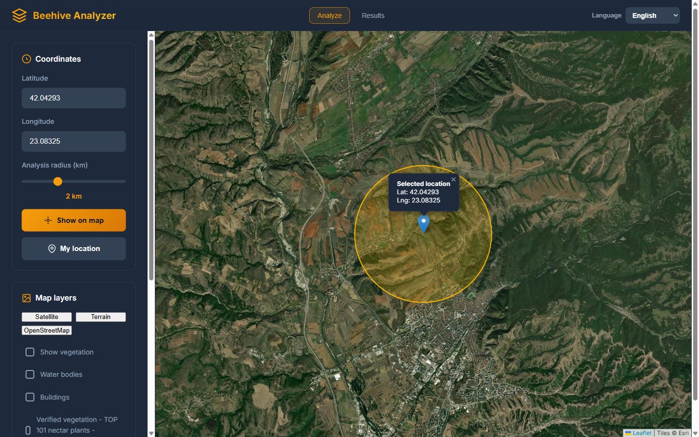
1. First Contact: Coordinates, Radius and the Map
Everything in Beehive Analyzer starts from three simple inputs, all visible the moment the page loads:
- Latitude and Longitude — the exact point of your (future) apiary. You can copy coordinates from Google Maps, from your phone's compass app, or type them by hand.
- Analysis radius (0.5–5 km) — a slider that draws the circle within which all plants, water, buildings and terrain are evaluated.
- "My location" — a single button that asks your browser for GPS permission and fills the fields automatically. This is the fastest possible workflow when you are physically standing on a candidate spot with your phone.
The logic behind the radius slider is pure bee biology. A worker bee normally forages within about 2 km of the hive and only stretches to 3 km or more when local food is scarce. That is why 2 km is the default radius — it represents the productive heart of the colony's territory. Drag the slider to 0.5 km when you want to compare two neighbouring micro-locations in a valley, or push it to 5 km when you are assessing a remote mountainside site where the bees have room to spread.
Press "Show on map" and the location appears immediately: a pin marking the exact point, and a yellow circle showing the analysed territory. The map itself has three basemap styles — Satellite (excellent for judging forests, fields and terrain at a glance), Terrain, and OpenStreetMap (best for roads and place names). Switching between them is one click in the "Map layers" panel.

ApiaryPro Flow Bee Hive — Automatic Honey Kit
- ✅ Harvest honey on-tap, directly from the hive
- ✅ Bees undisturbed during harvest
- ✅ Complete kit — everything included
The most innovative hive system available — automatic honey extraction, zero mess.
View on ApiaryPro →Before you even run an analysis, this first screen already answers practical questions: Is there a road nearby? How far is the village? Is the spot on a south slope? Does the satellite view show large uniform crop fields (mono-culture, short but intense bloom) or a mosaic of meadows, hedges and forest edges (longer, steadier forage)? Beekeepers who have moved hives for a living read these satellite images like a book — and now the numbers on top of them make the reading objective.
2. The Map Layers: Vegetation, Water and Buildings
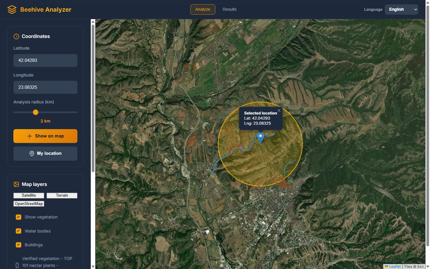
Below the basemap buttons sit three checkboxes that overlay OpenStreetMap data directly on the map: Show vegetation, Water bodies and Buildings. Tick any combination and the corresponding objects are drawn inside your analysis circle within seconds.
Why does this matter to you as a beekeeper?
- Water — a colony needs a reliable water source, preferably within a few hundred metres. The layer shows rivers, streams and ponds you may not even notice from the road, and the site analysis later measures the exact distance to the nearest one.
- Buildings — a quick sanity check for neighbours. More buildings means more people, more risk of conflicts, more chance someone sprays a garden with pesticides, and possibly more shade.
- Vegetation — outlines of forests, meadows and green areas, useful for a first impression of how "green" the radius really is.
These overlays are quick and light — designed for eyeballing, not for deep numbers. The deep numbers come next.
3. Verified Vegetation: 101 Nectar Plants, Scientifically Confirmed
Anyone can write "this region has acacia" on a website. Beehive Analyzer takes a stricter road: the "Verified vegetation — TOP 101 nectar plants" checkbox connects to the GeoPl@ntNet scientific plant-distribution service (powered by the same PlantNet community that identifies plants from photos worldwide) and lists, for your region, the classic nectar plants of the tool's database — each with a photo, a star rating for its honey yield, and, when you click a plant, a real distribution map painted over your satellite circle.
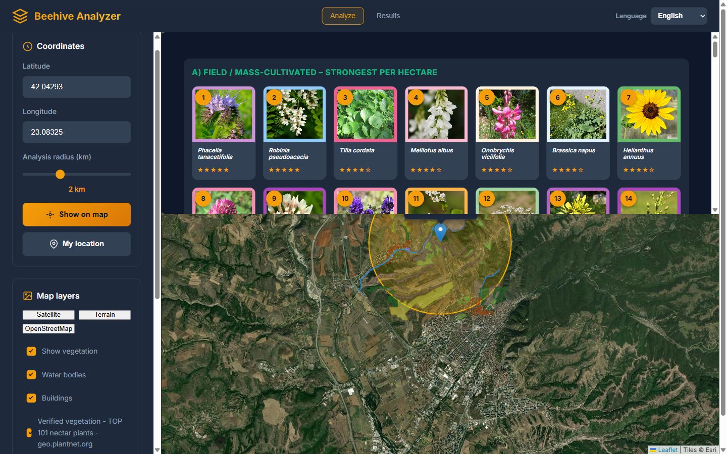
The plants are grouped by forage category: field and mass-cultivated plants (the heavy per-hectare hitters like phacelia, oilseed rape and sunflower), trees and shrubs (the cornerstones of most European honey: black locust, linden, chestnut), meadow plants, and so on. Each card is interactive: click a plant and the tool loads its verified distribution layer onto your map, so you can see — in coloured patches over the satellite image — where within your circle that plant actually grows.
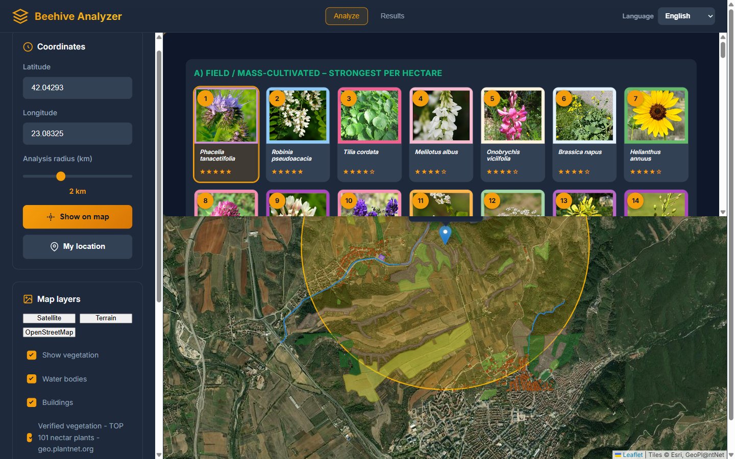
Compare this with the old way of judging a spot. Instead of "the guy at the café said there is acacia somewhere near the ridge", you see the acacia patch, its rough size, and whether it falls inside your bees' 2 km circle. Instead of guessing whether a valley is "good for linden", you see the linden stands on the northern slopes and know exactly how far they are from your stand.
This is also a planning tool for sowing your own forage: if you have a field inside the radius, the plant cards tell you which high-yield nectar plants (phacelia, sweet clover, sainfoin) are best suited to your region's list — and our seasonal nectar plants calendar helps you plan how their bloom chains together through the season.
4. Pests: Real Observation Data from GBIF and iNaturalist
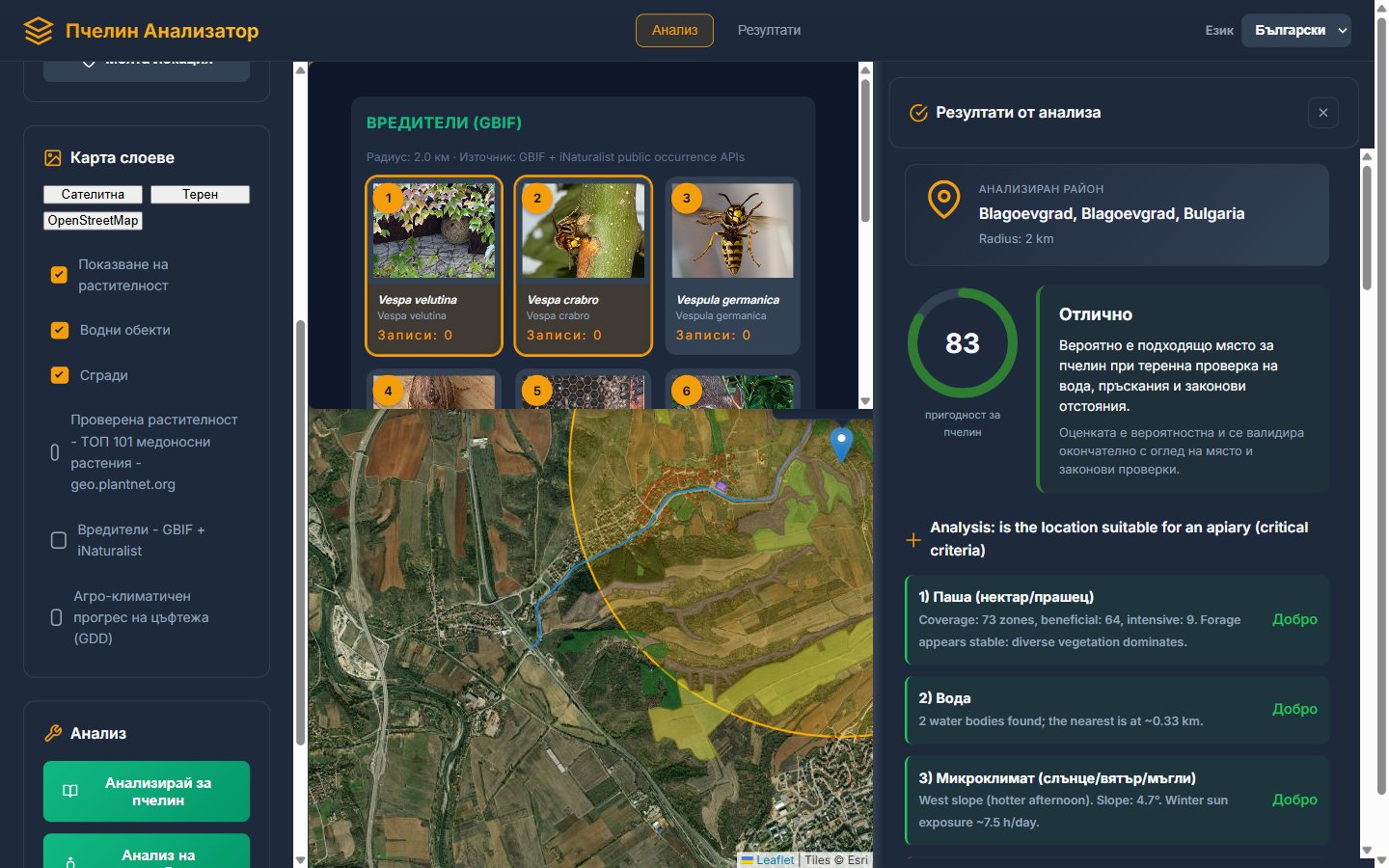
Choosing a good forage spot is only half the safety question — the other half is knowing which threats live in the area. The "Pests — GBIF + iNaturalist" checkbox loads a panel of key beekeeping pests and predators: the Asian hornet (Vespa velutina), the European hornet, German and common wasps, greater wax moth, small hive beetle, mice, and even bears in some regions. For each species, the tool queries two of the world's largest public biodiversity observation databases and places the actual recorded sightings on your map.
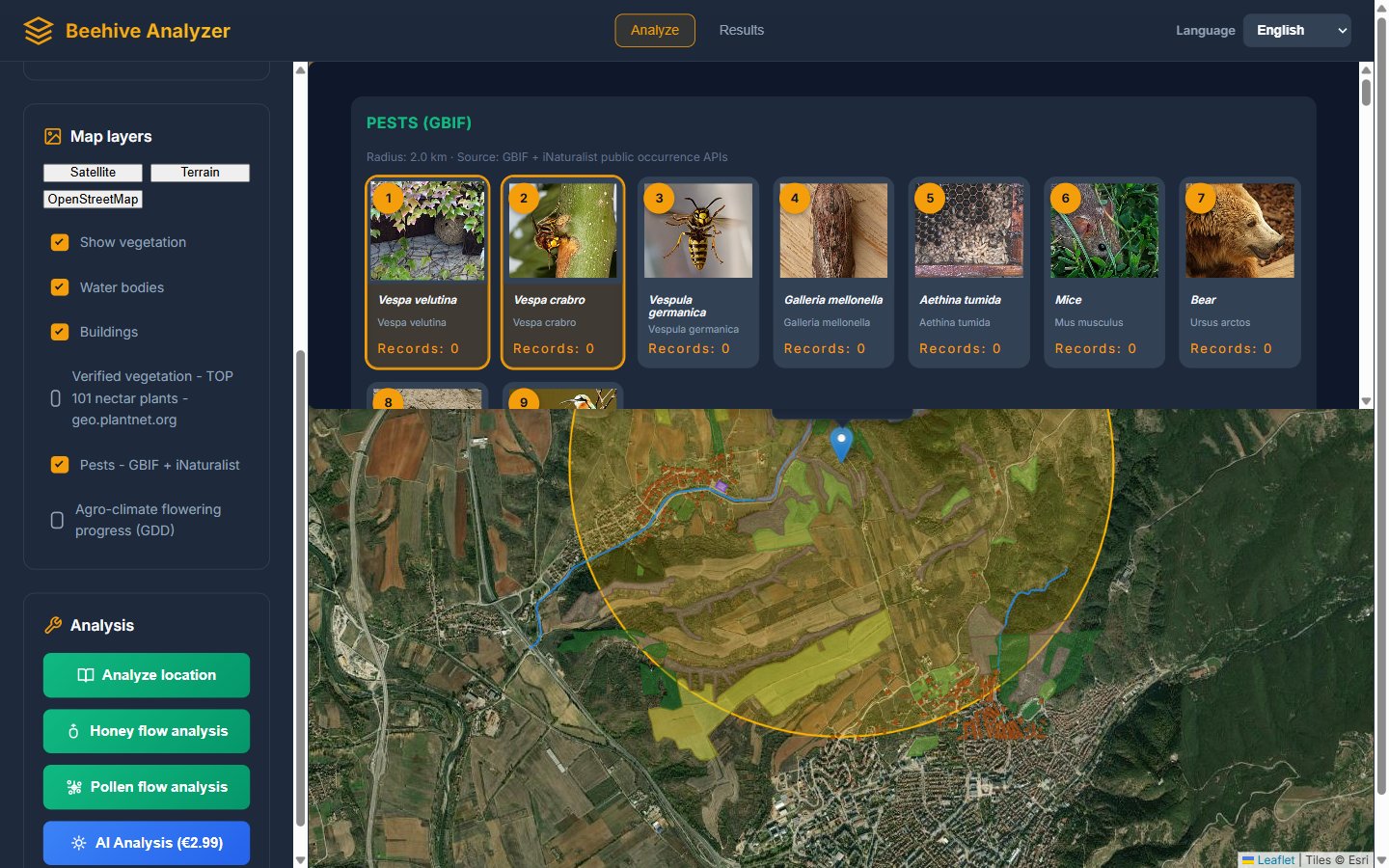
Two things make this genuinely useful rather than a gimmick. First, the data is real — each point is a published field observation from a citizen-science or research database, not an estimate. Second, it is local — if Asian hornet has been recorded in your county, this is exactly the kind of early warning that tells you to fit hornet traps before the first attack on your flight board, not after. A cluster of bear sightings inside your 5 km circle, meanwhile, is information you want before you build the electric fence, not after the first overturned hive stand.
5. The Star of the Show: Honey Flow Analysis
The "Honey flow analysis" button is the heart of the tool, and the reason most people come back to it. One click, and the analyzer evaluates up to 101 nectar plants against your circle: for every plant it measures how much of the area the plant actually occupies (its saturation), using the verified GeoPl@ntNet distribution layers, then multiplies that by the plant's known honey-yield coefficient. The whole run takes a couple of minutes, and you can watch it work.
5.1 Watching the analysis live
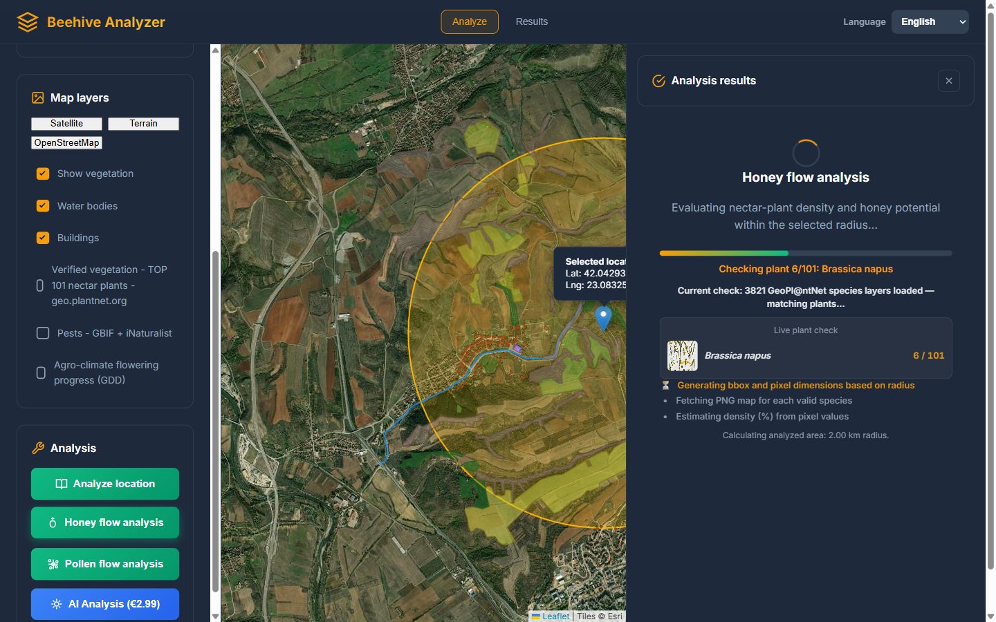
While it runs, the results panel shows a live tracker: the scientific name and photo of the plant currently being checked, a counter (for example "Checking plant 6/101: Brassica napus"), a progress bar, and a short explanation of what is being computed — density estimation from the distribution map, area calculation for your radius, and so on. It is oddly satisfying, and more importantly it tells you the tool is doing real per-plant work, not filling a screen with random numbers.
5.2 Reading the headline result
When the run finishes, the panel opens with the verdict card. In our example spot near Blagoevgrad it reads: Overall index: 10.4 / 100, radius 2 km, 101 plants processed — followed by a plain-language recommendation: "Low to conditional honey collection potential. Combined forage strategy and seasonal relocation are recommended."
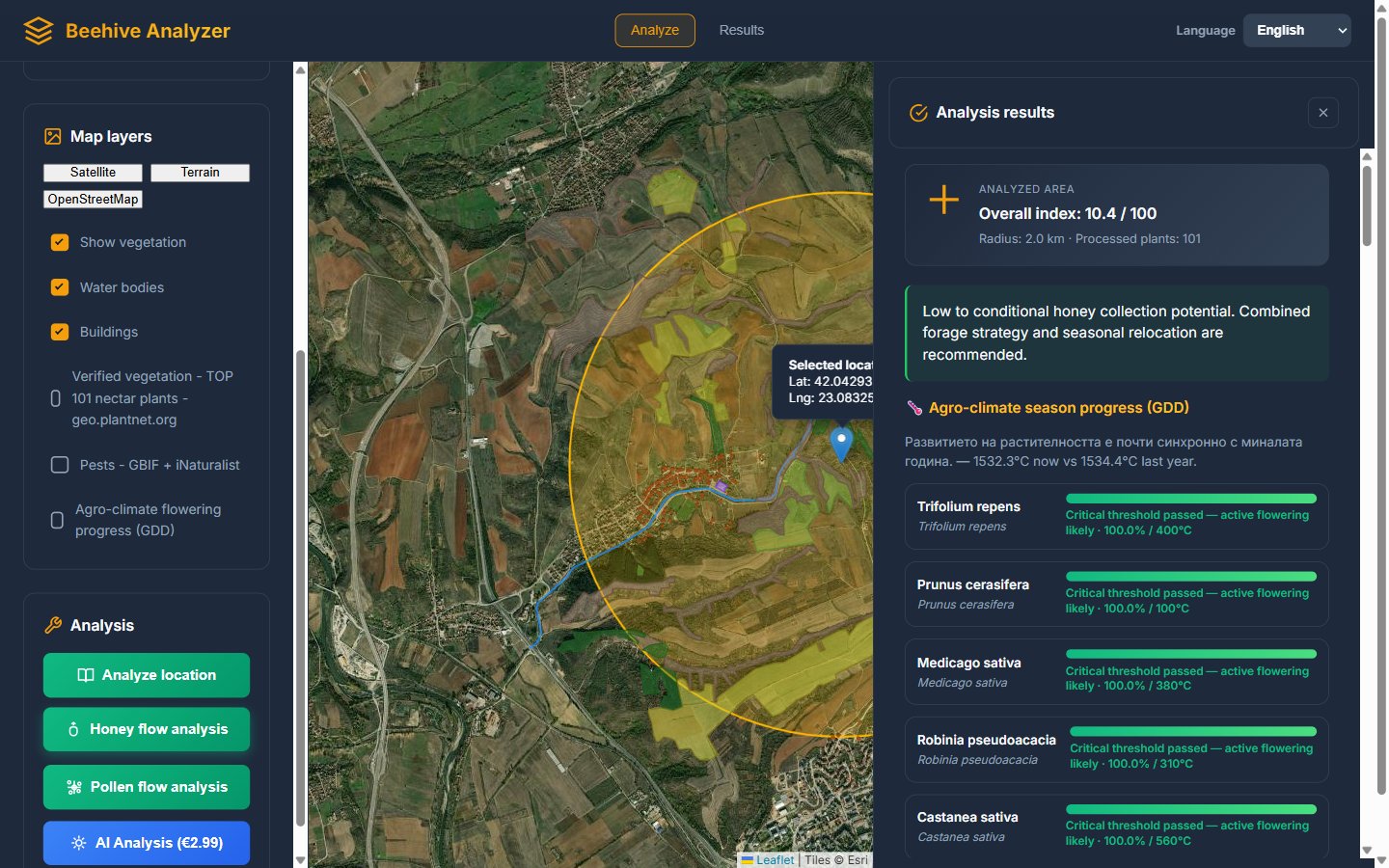
How should you interpret that number? The index is a relative measure: it tells you how much of your circle's real area is covered by strong nectar plants, weighted by how much honey each of those plants yields per hectare. The real power comes from using it comparatively:
- Run it on 3–5 candidate locations before choosing a new apiary site. A location scoring 35 against one scoring 10 is not a subtle difference — it is a season-making difference.
- Run it on your current apiary to finally understand why it produces what it produces. Many beekeepers discover their trusted spot is actually mediocre, and that the strong flows of past years came from one specific patch of linden inside the circle.
- Run it at different radii on the same point. If the 1 km index is much lower than the 3 km one, your bees will be flying far — which means more energy spent commuting and a stronger dependence on weather during flight.
5.3 The species table: your forage inventory
Below the verdict, the "Species details" section ranks the top 25 plants with five numbers per row: coverage percentage, regional honey index, category, and the confidence of the measurement (medium vs. estimated, depending on how much real data existed for the area). In our example: Echium vulgare at 78.7% coverage and index 432.6, Trifolium incarnatum at 88.9%, white and red clover, bird's-foot trefoil, hawthorn, vetch… This is effectively a forage inventory of your location, ranked by contribution.
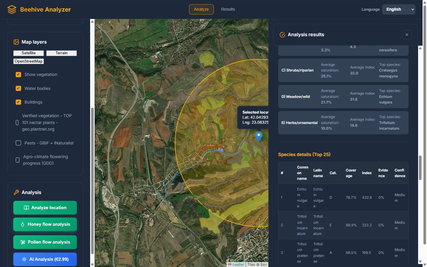
Practical beekeepers can turn this table into decisions directly. Lots of clover and alfalfa? Your main flow will come late, and you can keep supers ready in June. Oilseed rape near the top? Expect an intense but short early flow, and plan your swarm management around it — the rape table also tells you the category letter so you know whether a plant is a mass-cultivated field crop (intense, short), a tree (reliable, weather-sensitive at bloom), or a meadow plant (steady, moderate).
5.4 Area profile and the flowering calendar
Next comes the section that turns the inventory into a season plan: the area profile (what share of your circle is mixed vegetation, shrub, tree cover, fields, water, meadow, gardens) and the month-by-month flowering chart. In our Blagoevgrad example, the chart shows the classic profile of a mountain valley: quiet January–February, build-up through March and April, a peak in May–June, a secondary shoulder in August–September as the late sources (crown vetch, ivy) open, and nothing in November–December.
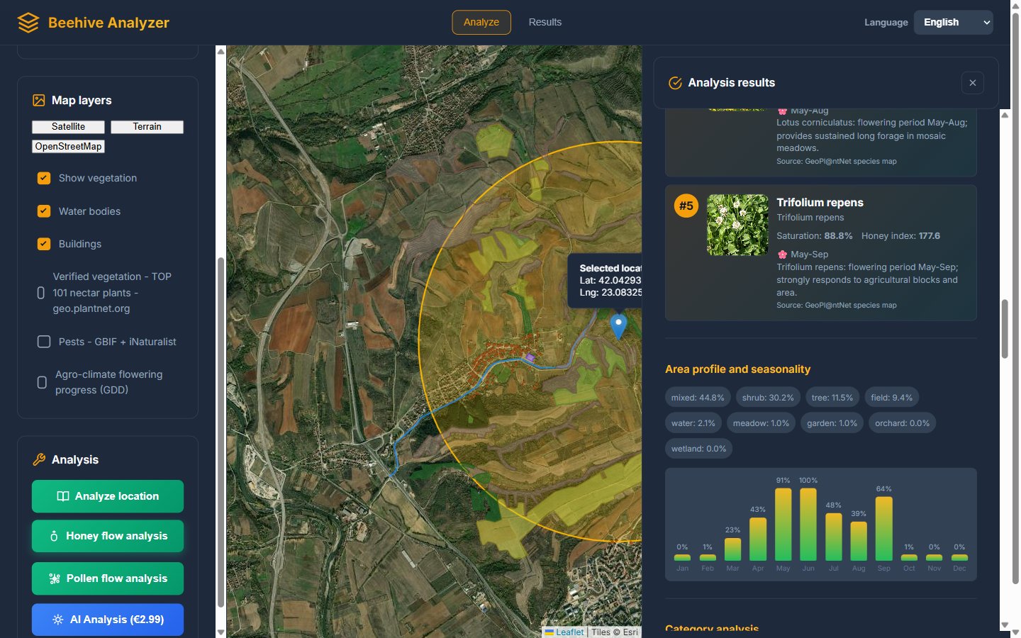
Read this chart the way a migratory beekeeper reads a bloom map. If May–June towers over everything else, that location is a "main flow site": strong colonies in spring, harvest in June, and possibly nothing worth staying for in August. If the chart is flatter — several medium bars from April to September — the site suits a stationary apiary with steadier, smaller harvests and easier colony management. Neither profile is "better"; they suit different beekeeping strategies, and now you can see which one you are standing on before you place a single hive.
The whole analysis can be exported as CSV with one click — useful if you like comparing locations side by side in a spreadsheet, or if you keep your records in the beekeeping software you already use.
6. Pollen Flow Analysis: The Other Half of Bee Nutrition
Honey is the fuel, but pollen is the building material — it is what feeds the brood and determines how fast your colonies can grow. A location can be a mediocre honey spot and a superb pollen spot (or the reverse), and long-term colony health depends on both. The "Pollen flow analysis" button runs the same kind of plant-by-plant evaluation against a database of 100 pollen-bearing plants, with pollen-specific yield coefficients.
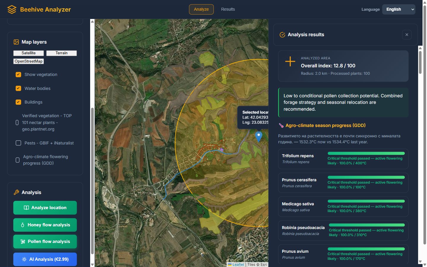
You read the results exactly like the honey results: an overall index on the 0–100 scale, a ranked species table, and the seasonal chart — this time of pollen availability. Watch for one specific pattern: locations with early pollen (willow, crocus, hazel in February–March) let your colonies start brood rearing early and strongly, which is the foundation of a strong main-flow colony. Locations whose pollen chart is weak in early spring but strong in summer are fine for building nucs and splits later, but your spring development will need support — perhaps early pollen-substitute feeding or simply realistic expectations in April.
Beekeepers focused on queen rearing get a special benefit here: queen producers need a long, uninterrupted pollen curve more than a high honey index, because continuous brood rearing from April to August is what fills mating nucs and feeds virgins. Run the pollen analysis on your queen yard candidates and choose the flattest, widest pollen chart you can find.
7. Site Analysis: Is This Actually a Good Place to Keep Bees?
Great forage on a bad spot is still a bad apiary. The "Analyze location" button answers the broader question: is this place suitable for hives at all? It combines the address (via reverse geocoding), elevation, slope and sun exposure, historical climate, water sources, building density and more into a single apiary suitability score from 0 to 100 — with a clear label. For our example point near Blagoevgrad the tool returned: 83 — Excellent.
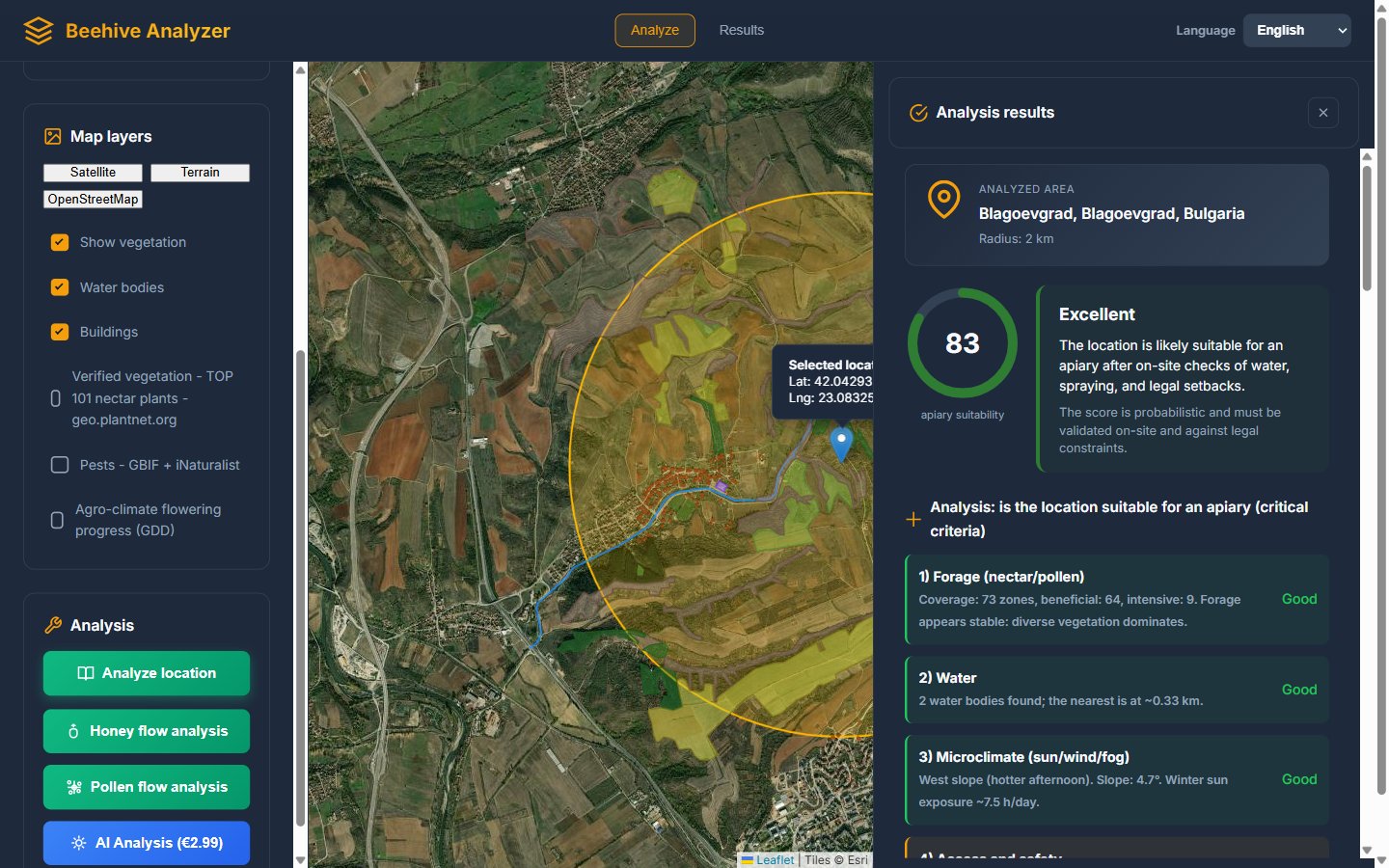
What makes this section trustworthy is that the score is not a black box. Right below it, the tool lists the critical criteria it evaluated and how each one scored:
- Forage — how many forage zones were found in the circle and how many are beneficial (in our example: 73 zones, 64 beneficial, 9 intensive).
- Water — how many water bodies, and the distance to the nearest one (0.33 km here — excellent).
- Microclimate — slope, orientation, and estimated winter sun hours per day (a west slope means hot afternoons; a 4.7° slope with ~7.5 winter sun hours/day is solid).
- Access and safety — building density in the radius (360 buildings in our example flagged a shading and neighbour-conflict risk), proximity of roads, and related warnings.
Each criterion carries its own rating, so you know exactly why a location scored what it scored — and what you could fix (a water trough solves a water problem; nothing solves a highway next to the flight path). The tool is honest about its limits too: it reminds you that the score is probabilistic and that local legal constraints (setbacks from neighbours, protected areas, spraying contracts with farmers) always need on-site verification.
8. GDD: The Agro-Climate Flowering Progress Panel
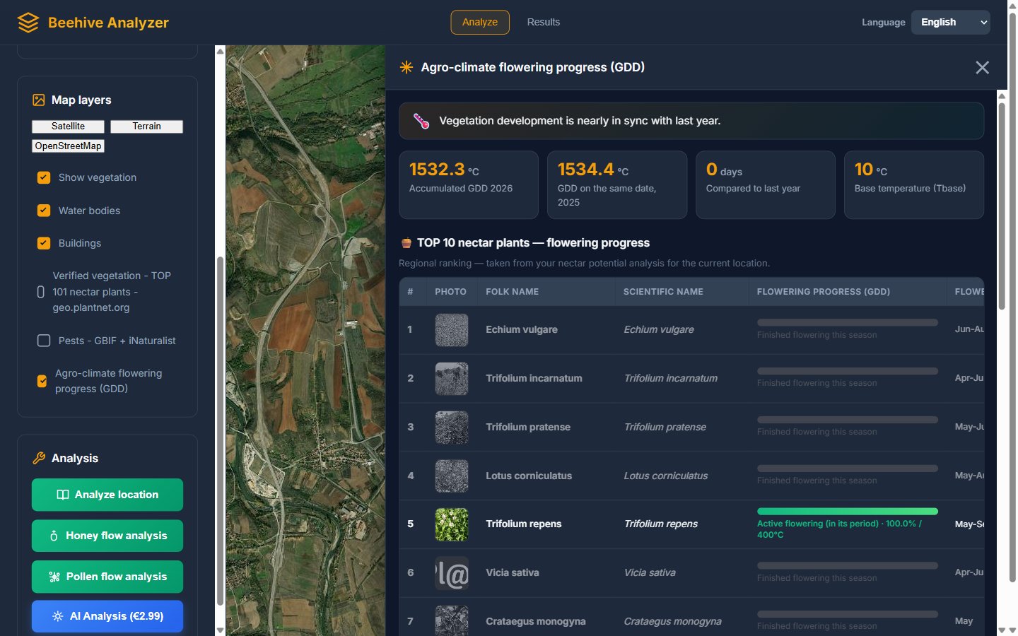
One of the newer and quietly brilliant features is the "Agro-climate flowering progress (GDD)" checkbox. GDD stands for Growing Degree Days — a heat-sum model that agronomists have used for decades to predict crop development. The idea is simple: plants do not read the calendar, they read accumulated warmth. Every day with an average temperature above 10°C contributes its degrees above 10 to a running seasonal total, and each plant starts flowering when its total is reached — willow around 60 GDD, cherry plum around 100, black locust around 310, linden around 620.
Tick the checkbox and the tool runs a pipeline: it performs (or reuses) your honey and pollen analyses for the location, then compares this year's accumulated heat with the archive data for the same calendar date last year. A floating panel appears with four stat cards and two tables.
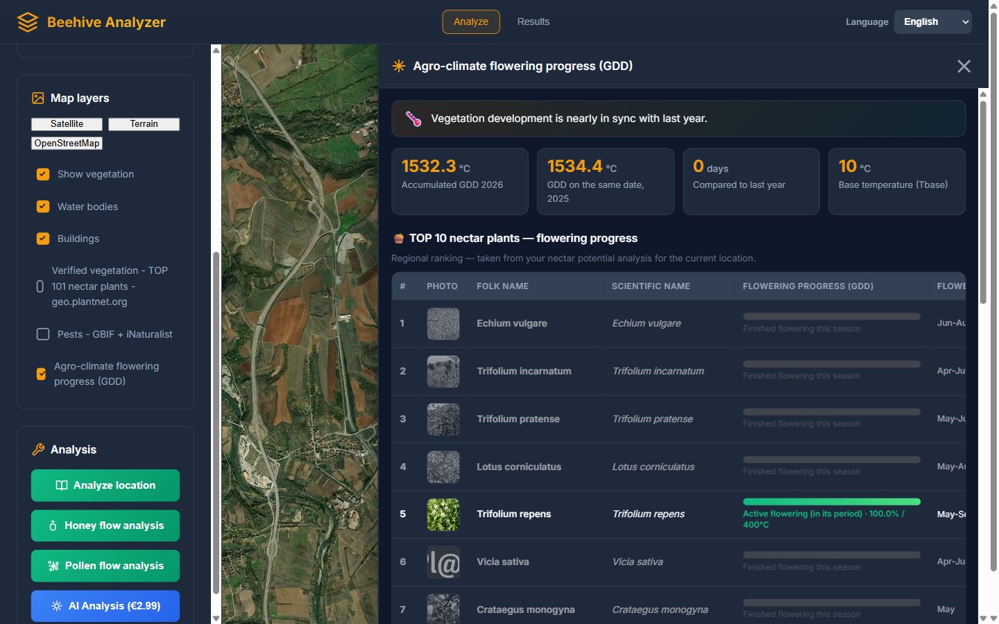
In our September example the panel said: 1532.3°C accumulated this year vs. 1534.4°C on the same date last year — vegetation development nearly in sync with last year, 0 days difference. Each plant row then shows a progress bar toward its own flowering threshold and a seasonal state: greyed rows for plants that have finished flowering this season, a green bar for plants in active flowering right now (white clover, in our example, 100% — still going), and muted bars for plants whose bloom is still ahead.
Why does this matter to you? Because it answers the question every beekeeper asks from February onwards: "Is this year early or late?" — not with a feeling, but with a number, compared against last year's archive for your exact location. If the season is 12 days ahead, you inspect earlier, add supers earlier, and treat for varroo earlier. If it is behind, you know the main flow will slide, and you plan your holidays accordingly. It is the kind of decision-support information that used to be available only to agronomists with weather stations — now it is a checkbox.
9. The AI Combined Report: Everything in One Readable Document
So far every feature is free. The one paid option is the "AI Analysis (€2.99)" button, and it is aimed at the moment when you want all of the above — site suitability, honey flow, pollen flow, season context — merged into a single coherent report, written in plain language, without you having to piece the tables together yourself.
Here is the practical workflow. First you run the free analyses (site, honey, pollen) so their results are ready. Then you press the AI Analysis button, confirm, and pay €2.99 via PayPal. The tool then sends your three result sets to a modern AI model with instructions to synthesize them — and shows you live progress while it works section by section: location, honey potential, pollen potential, and a final synthesis with recommendations. The resulting report can be exported as a PDF.
Who is this for? Three groups, realistically:
- Beekeepers evaluating an expensive new location — if you are about to invest in a remote apiary, truck transport and a season of your time, €2.99 for a structured second opinion is the cheapest line item in the entire project.
- Beekeepers who want to share the analysis — a written PDF makes sense to landowners, partners and agricultural consultants who will not read interactive tables.
- Those short on time — the report reads the tables for you and connects the dots between forage quality, season timing and site risks.
If you already know how to read the free tables (and after this guide, you will), the paid report is optional — the numbers underneath are exactly the same. That is a fair design: free for those who read data, paid for those who prefer prose.
10. Languages, Links and Everyday Workflows
Small things that make daily use pleasant: the interface switches between English and Bulgarian from the header dropdown, instantly, including all dynamic content like the pest panel and the GDD tables. Every analysis you run is remembered for the session (the browser caches results per location and radius, so re-opening the same spot does not re-run the two-minute analysis). And the site supports deep links: a URL of the form beehive-analyzer.eu/?coords=42.04293,23.08325,2 pre-loads the location and radius and can even auto-start an analysis — which means you can bookmark your home apiary, or share an exact analysis-ready link with a friend.
Four everyday scenarios where the tool shines
Scenario A: Choosing a new out-apiary. You have three candidate spots. For each one: press "My location" on site (or enter coordinates), run the site analysis for the suitability score, run the honey flow analysis for the forage index, and note the flowering chart shape. Compare the three and shortlist. Then physically visit the winner, check water and access with your own eyes, and confirm the tool's verdict with local knowledge. Total invested time: about 20 minutes per location.
Scenario B: Understanding your existing apiary. Run the honey and pollen analyses on your current site. Many beekeepers are surprised: the spot they considered "average" shows a strong hidden index, or vice versa. The species table shows which plants your bees actually work — knowledge that changes how you manage the spring build-up, when you add supers, and what varroa-treatment windows you have between flows.
Scenario C: Season timing and inspection planning. Open the GDD panel in early spring and compare with last year. If the season runs 10+ days ahead, move your spring inspection schedule earlier — the first nectar plants (willow, crocus) will be finishing before you expect them. Combine this with the flowering calendar from the honey analysis and you have a month-by-month plan for supering, splits and treatments. Record each inspection afterwards in Beekeeping Diary so next year's comparisons are grounded in your own data too.
Scenario D: Migratory beekeeping decisions. If you move hives for flows, the radius slider becomes a scouting tool: run the honey flow analysis on the black locus region in April, on the linden belt in May, on the sunflower plains in June, and compare the indexes with realistic timing. The GDD panel tells you whether the destination's bloom is early or late this year — which is exactly the difference between arriving on time and arriving a week after the flow peaked.
11. How It Pairs With Beekeeping Diary
Beehive Analyzer answers the question "where should my bees be?" The free Beekeeping Diary app answers the question "what do I do with them there, week after week?" The two are made by the same team and designed as a pair:
- You analyze locations with Beehive Analyzer, then register the chosen spots as apiaries in Beekeeping Diary.
- You inspect your hives and record what you see in the diary — brood frames, food, queen status, with photos. The frame visualization feature lets you sketch each hive's layout frame by frame.
- The diary's BeeAI analysis reads your records and returns a health score, short-term and long-term plans, risks and optimization advice for each hive individually.
- Next season, you compare: the location's predicted forage (from the analyzer) against the actual harvest and development you logged (in the diary). That feedback loop — prediction, result, comparison — is how experienced migratory beekeepers and commercial operations think, and nothing about it requires anything more than a browser and a free account.
If you are new to record-keeping itself, start with our guide on how to keep a beekeeping diary — digital vs paper; the habit matters more than the tool. And if this whole season of planning talk is ahead of you, our beekeeping for beginners guide is the right place to start.
12. Honest Limitations and How to Work With Them
A tool this useful deserves honest limits, so you can trust the numbers appropriately:
- Plant data is verified but not perfect. The PlantNet layers and OpenStreetMap land cover are the best public data available, but a freshly ploughed field takes time to appear in any database. Treat saturation numbers as a very good estimate, not a survey.
- Weather is not in the index. A location with a linden index of 40 can yield nothing in a year when the linden bloom is washed out by rain. The analyzer tells you the potential; the sky delivers the reality.
- Rural data density varies. In well-mapped parts of Europe every hedge is in OpenStreetMap; in remote areas the data is thinner and more of the results will be marked "estimated". The tool labels its confidence honestly — read those labels.
- Legal and human factors are yours to check. Setbacks, protected areas, local farmer spraying schedules, and neighbour relations cannot come from a database. Use the 83/100 score as a green light for deeper checks, not as permission.
Used this way — as a powerful first filter and comparison engine, followed by your own eyes and local knowledge — the analyzer genuinely changes how decisions get made. The beekeepers who benefit most are the ones who run it on several locations before committing, and re-run the GDD panel every spring to recalibrate the calendar.
Frequently Asked Questions
Is Beehive Analyzer free to use?
Yes. The location analysis, honey flow analysis, pollen flow analysis, map layers, verified vegetation, pest maps and the GDD panel are all free and require no registration. Only the optional AI combined report is a paid extra (€2.99), because it synthesizes everything into one professionally written document.
How accurate is the honey flow analysis?
It combines verified PlantNet distribution layers with OpenStreetMap land cover, and reports saturation percentages per plant plus an overall 0–100 index. Treat it as a strong comparative instrument between candidate locations — real yield still depends on weather, colony strength and your management.
What radius should I choose?
Bees forage mainly within 2–3 km, so the default 2 km is a good start. Use 0.5–1 km for micro-location comparisons, and up to 5 km for remote or migratory sites where bees can range further.
Do I need to register?
No — everything free works anonymously in the browser. To record results, plan inspections and track hives over time, connect it with the free Beekeeping Diary app.
What does the GDD panel tell me?
How much warmth the season has accumulated since March 1 at your exact location, compared with the same date last year — and, for the top 10 nectar and pollen plants around you, whether their flowering is finished, active, or still ahead.
Does it work on a phone?
Yes — and the "My location" button plus GPS makes it the fastest way to analyze a spot while you are physically standing on it.
Analyze Your Apiary Location Today
Run your first free honey flow analysis in the next 5 minutes — no account needed.
📍 Open Beehive AnalyzerThen keep your bees organized all season:
🐝 Start Beekeeping Diary Free